Eindhoven data scientists take on corona data to predict growth of new infections

From March 11 till the end of April of 2020, TU/e statistician Edwin van den Heuvel and a small team of data scientists published daily predictions of the Corona pandemic on this page. Now that the daily updates have come to an end (for now; the researchers will publish new results once the pandemic flares up again), it is time to look back. The researchers present a number of graphs which show the infections and deaths in all 24 countries in one view, allowing for easy comparison of the trends. We also publish an interview with Edwin van den Heuvel, in which he looks back on the whole project. You can find an archive of all previous predictions here.
Number of infections
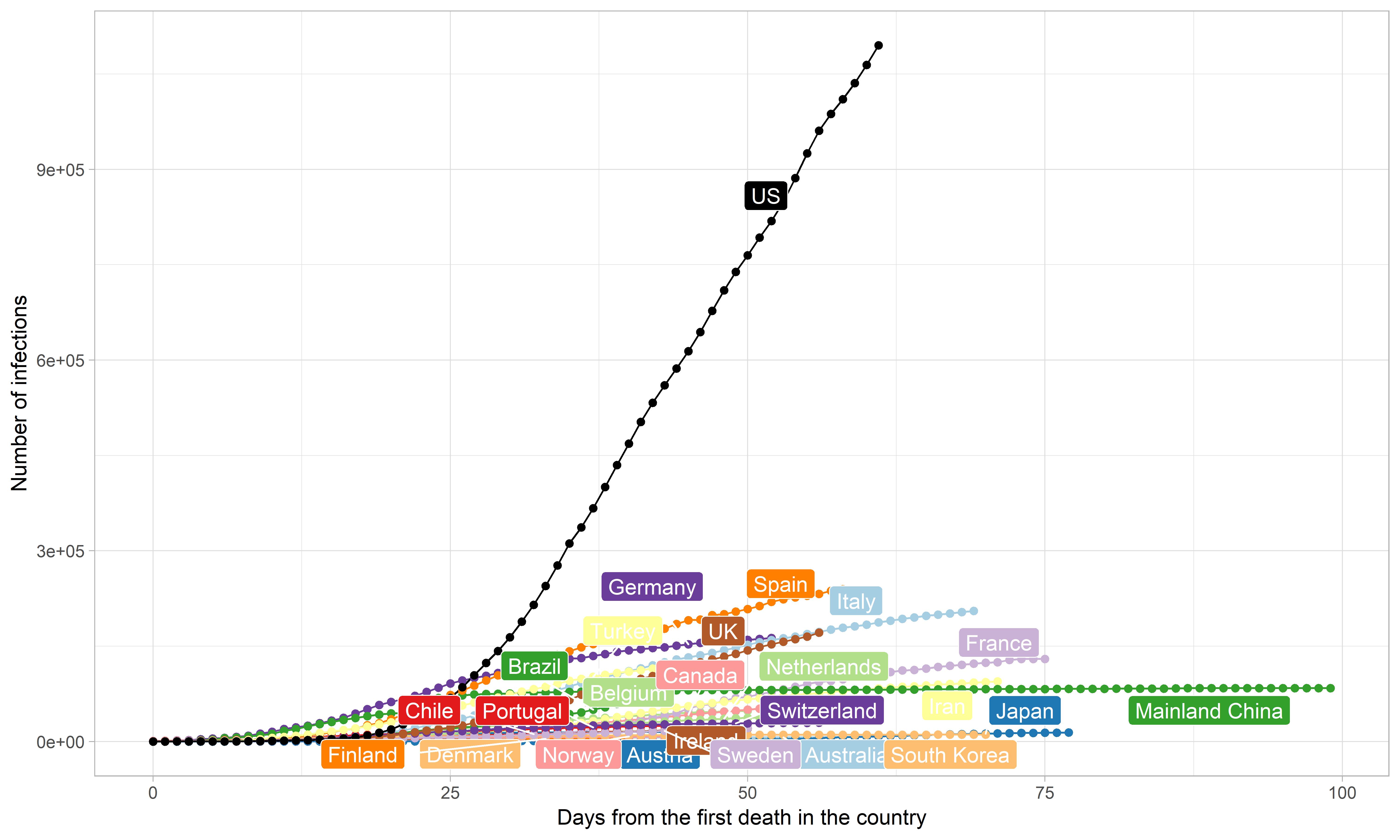
As anticipated by our previous predictions, many countries appear to be over the turning point. This is clearly shown by the flattening curves in most countries in the plot showing the absolute numbers of infections (image 1). However, the scale of the y axis is quite large, which hides the trend for smaller countries. The US clearly stands out in the graph: the values in that country are much larger than the rest, and the curve for this country does not appear to be flattening just yet. On the contrary, it seems US is still growing hard.
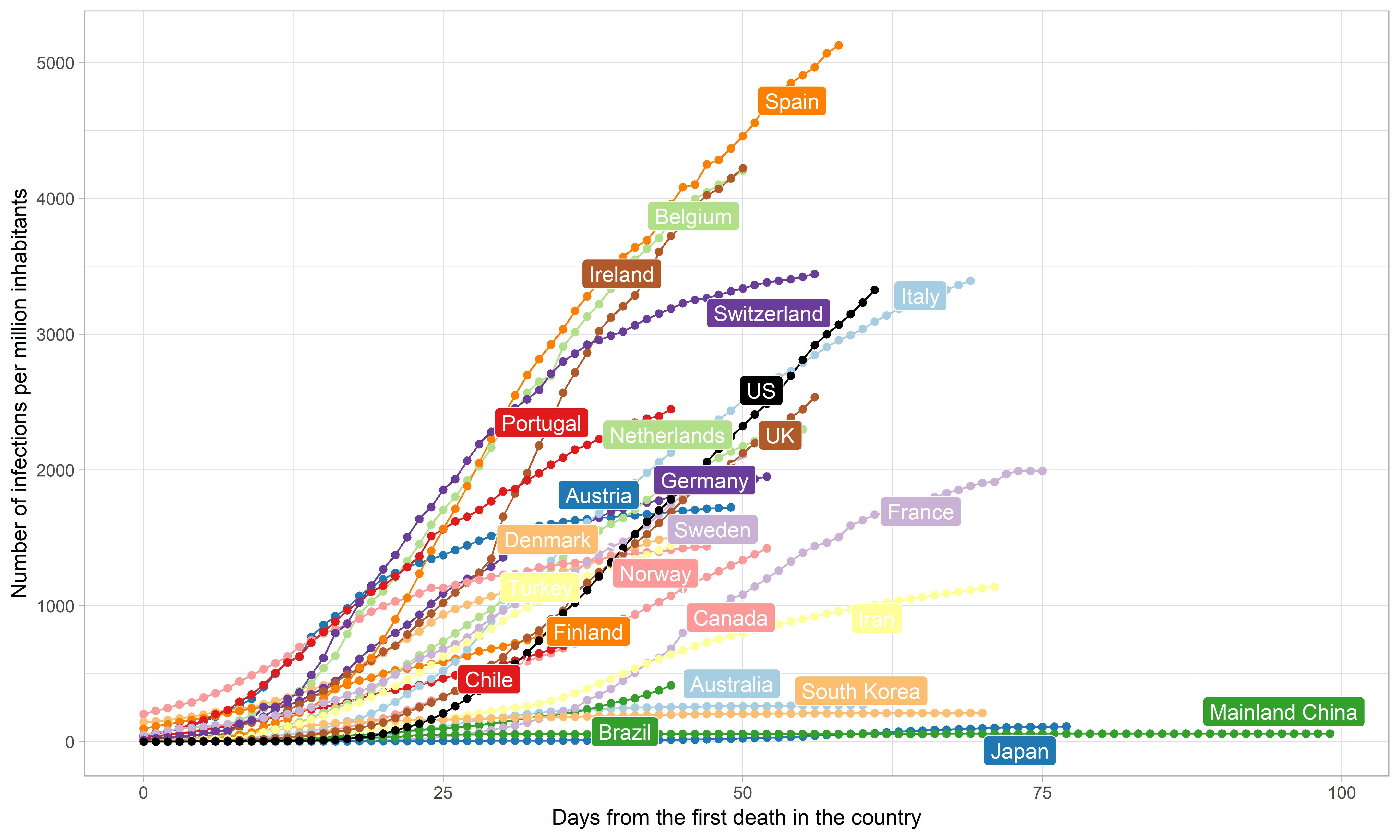
To have a better understanding of the relative growth in the different countries, we look at the number of infections per million inhabitants instead. From this plot, it actually seems that Spain, Belgium, Ireland, US and UK have a steep growth, and the stabilizing trend is less visible than when looking at the absolute values. On the other hand, Switzerland, Austria, Norway, Germany and Iran are most clearly stabilizing. From the plot also France appears to be stabilizing at the moment, but data from that country is unreliable (official resources reported a marked decrease in the cumulative number of infections on April 29, while other resources reported much larger numbers already since early April).
It also seems countries could be grouped by growth rate in roughly three clusters, with steep, medium and slow increase.
Click for full image
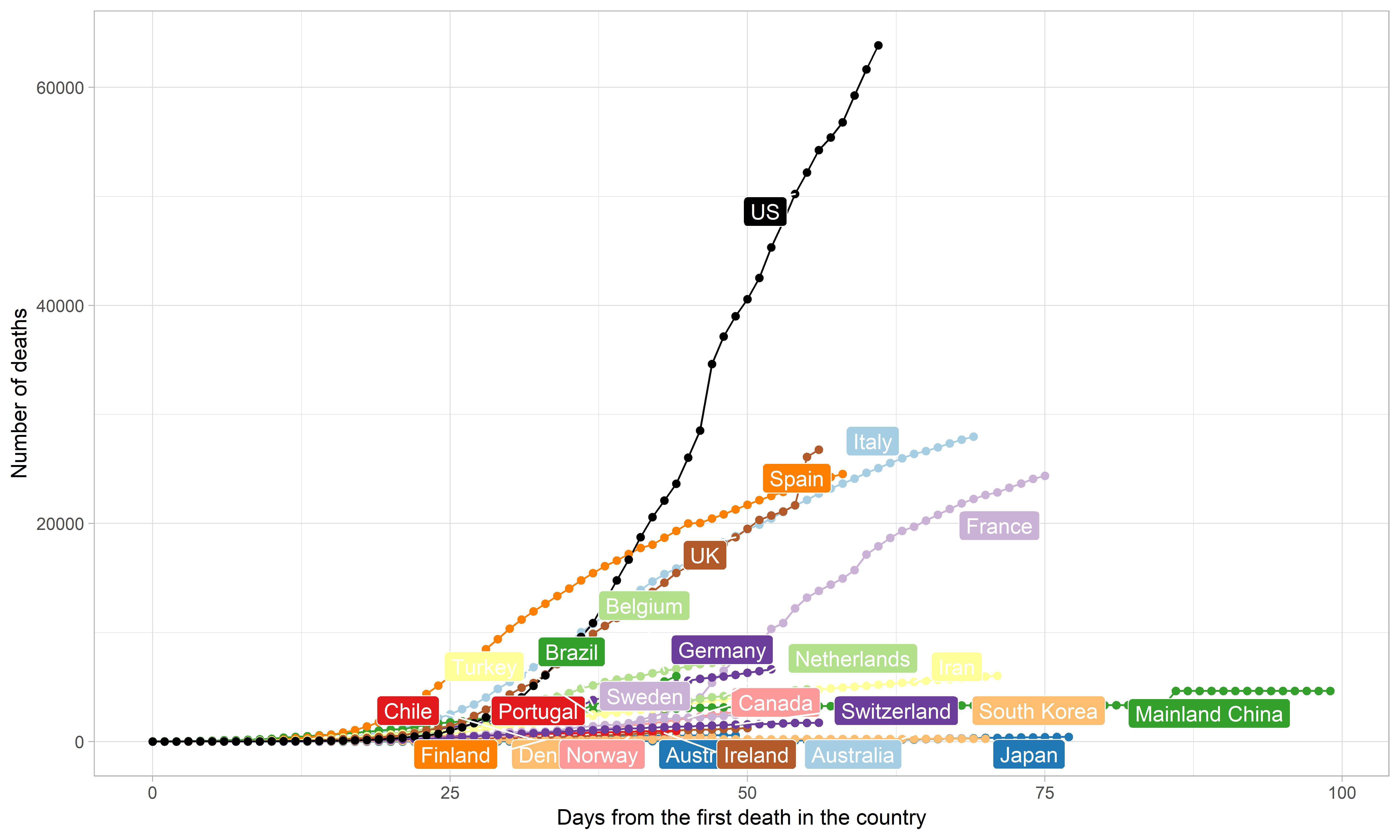
Number of deaths
For the number of deaths, something similar holds. The absolute values show a stable increasing trend for US, while the curves for Spain, Italy and France seem to be slowly stabilizing. UK had a marked increase on April 27, making the curve discontinuous.
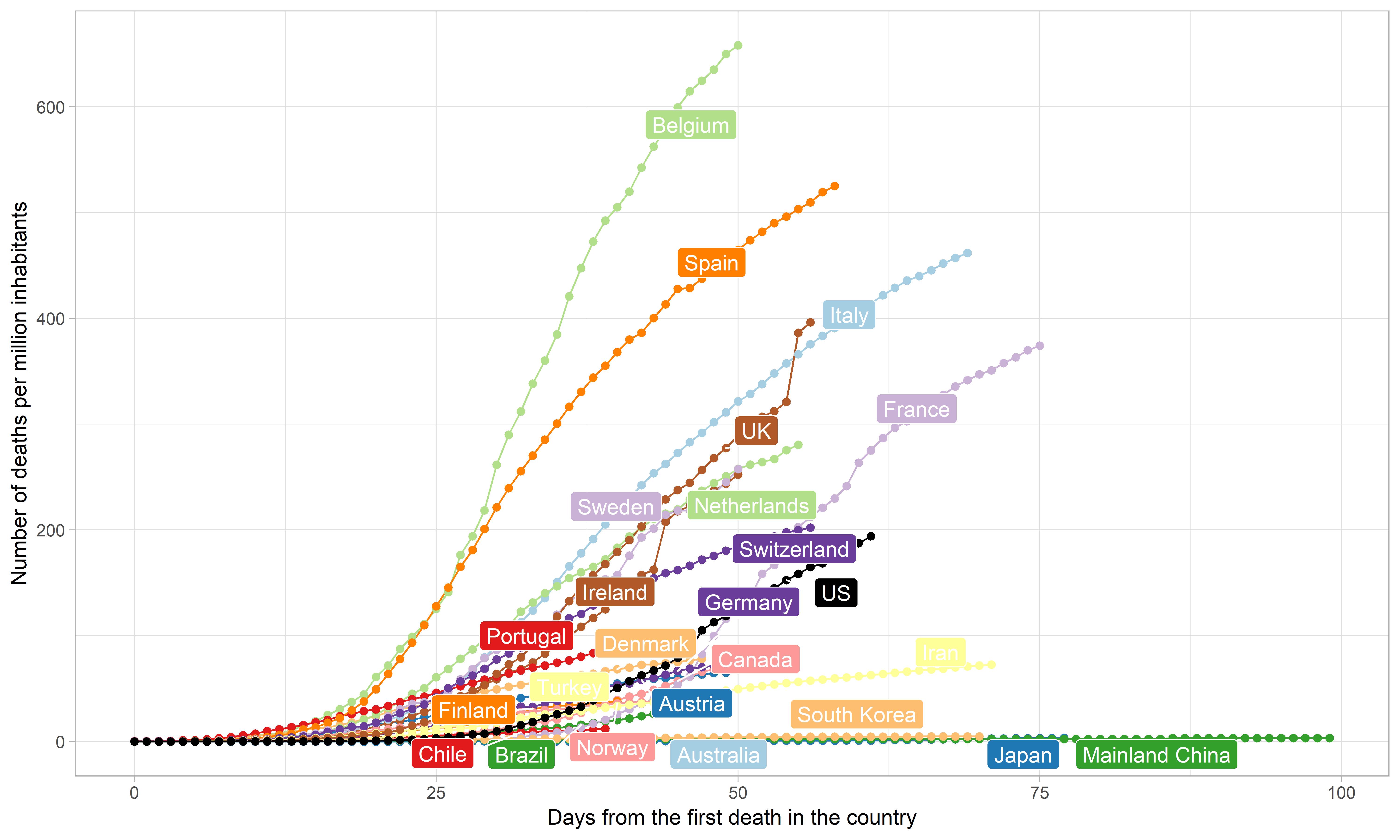
Again, the curves of the relative numbers are much more spread apart than the curves for the absolute values. At the moment, Belgium, Spain, UK and Italy have the largest number of deaths per million inhabitants. Belgium has more than 600, Spain more than 500, Italy almost 500 and UK is just reaching 400 deaths per million inhabitants.
However, there is a delay in the number of deaths with respect to the number of infections, and since the latter are still growing, we can expect that also the curves of the number of deaths will still change significantly.
Click for full image